Box sets are hugely popular on Kobo at the moment. Our best selling titles on Kobo Writing Life are nearly always ones that are part of a greater series. It’s important to note that we have no limit on the price that you can set your box set. You can set as high as you’d like and still receive 70% royalties! Here are some tips to help you create a great box set.
The Content
Whether your box set is three books or ten books, you should really spend time ensuring that it’s easy to navigate through your finished ePub. You want your reader to be able to easily go through each title so it’s important that you check your Table of Contents. Maybe you don’t need to include a specific link to your acknowledgments or about the author section for each book. You may want to consider creating a new Table of Contents for your box set.
The Cover
Let’s face it, people judge books by their covers. It’s also the first thing the Kobo Merchandising Team look at when they’re trying to decide which books should be included in promotions. It’s really important to have an eye catching cover that captures the theme of your book.
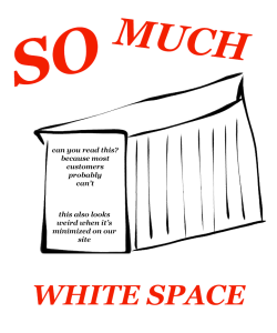
When you’re making the cover for your box set you should thinking about the type of cover you want to use. This might be surprising, but we strongly recommend avoiding a cover that has a 3D box set on a plain white background.
The reason why we’re not the biggest fans of these covers is because of the unusued white space. This is going to make make your cover appear significantly smaller in our store. It’s also really hard for a customer to read the details on the cover. You should be trying to entice readers by easily showing them what books are contained in your box set.
So what style of cover should you use for a box set? There are lots of cover options that you can choose from. Here are some examples of covers that we’ve really liked:
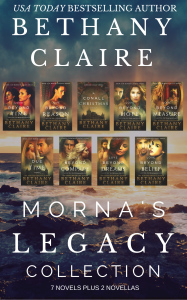
Collage of individual book covers
This cover includes a snippet of each individual book cover and merges them into one box set cover. As the individual covers all have a similar theme, they work really well together.
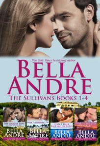
Feature image with smaller individual book covers
This cover uses the cover of book one in the series as its main focus but it’s still really clear that this is a box set. The emphasis is on the author name and the inclusion of the covers for books 1-4 make it really clear to the customer that this contains all of the books.
3D book covers with a coloured background
This is a great example of when 3D covers can be used on box sets. The most important thing to remember is to have a coloured background. Using plain white can make the cover image seem much smaller on site.
2D book covers with a coloured background
Here is another example that also shows how a coloured background can be used to tie in multiple book covers. You don’t need to use a plain coloured background. A subtle image works well to give the reader a sense of the overall theme.
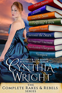
Feature image with book spines
This cover has one main feature image but includes the individual book titles on a stack of book spines. It’s a good alternative if you don’t want to include all of the individual book covers.
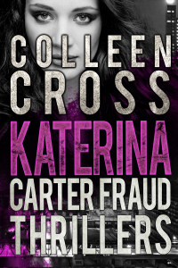
Feature image with large text
The text in this cover image is the main focus. This is what’s going to tell the customer that it’s a box set. The font and cover layout have the same theme as the individual books so it’s easy for the customer to tell that this is the same series.
Good luck with creating your new box sets! If you have any tips about how you created a great box set, let us know in the comments.
